Case study
SF
The identity behind this portfolio. An interlocking SF monogram, a palette led by ink and cobalt and a type pairing that sits between engineering and craft, built to hold together from a favicon to a full-screen hero.
The mark
An S and an F set in Quattrocento and drawn so the two letters share one space, the S curving through the stem of the F. It stands for the two halves of the work, design and engineering, treated as a single practice rather than two services side by side.
On the site the mark carries a slow gradient from ink through cobalt to navy, so even the logo has a little life to it.
Four directions
Four directions were explored before settling on the interlock, each with a different character. The interlock was chosen for carrying the most character in the smallest space.
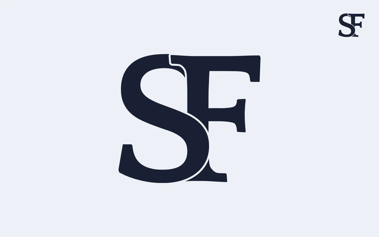
Interlock
Considered and crafted.
Two letters sharing one space, design and engineering as a single practice.
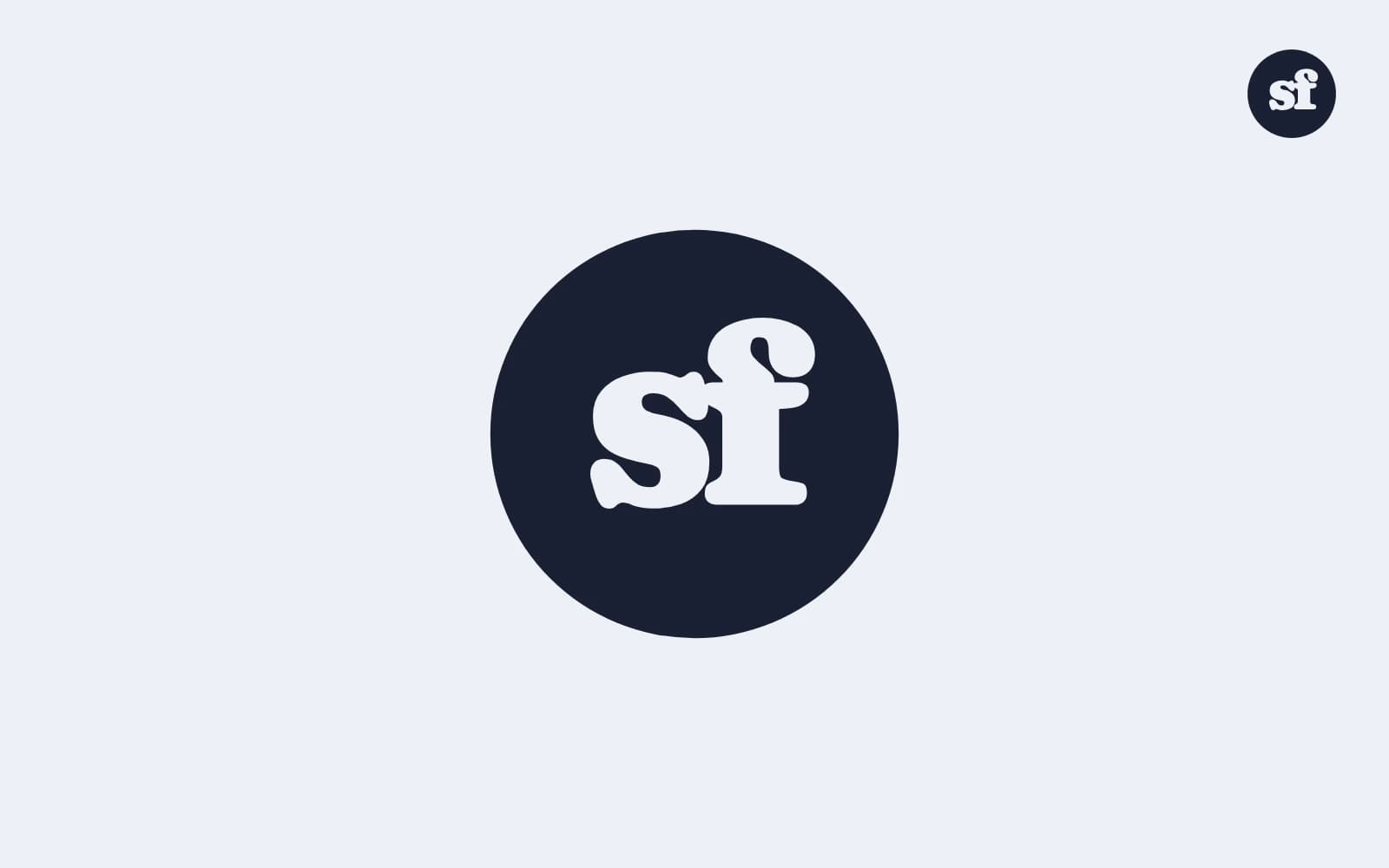
Disc
Friendly and bold.
A lowercase sf in a soft disc, more personality than polish.
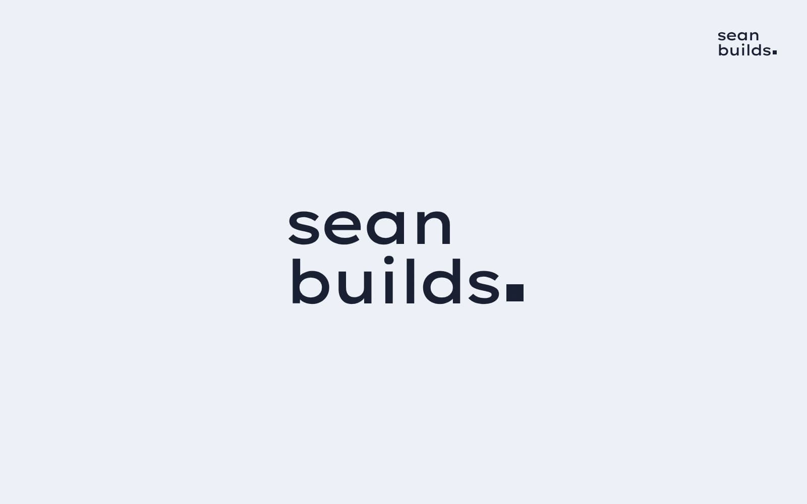
Stacked wordmark
Clean and modern.
Name and craft stacked in Lexend Giga, closed with a square full stop.
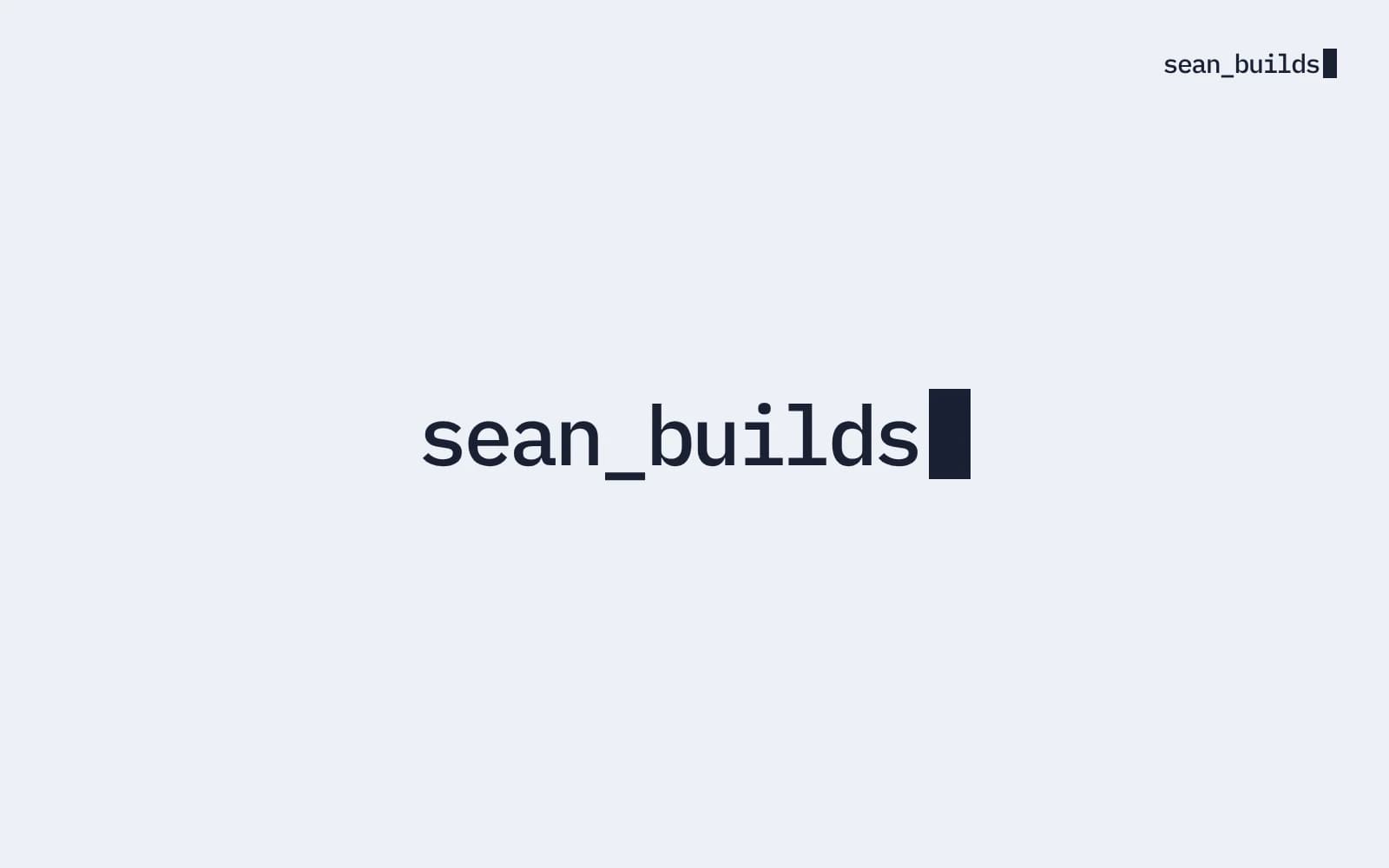
Cursor
Technical and direct.
A block cursor that reads as code first and design second.
Colour
A cool, quiet ground of mist and paper keeps the work in front. Ink carries the type, navy and cobalt carry action and emphasis, and butter is used sparingly as a warm counterpoint.
- Mist#EDF0F5
- Paper#FAFBFD
- Ink#1A2033
- Navy#22326F
- Cobalt#2348E8
- Butter#F1DE9C
Type
Lexend Giga for headings: wide, geometric and set with tight tracking so it stays compact at large sizes. Quattrocento for reading: a classical serif that echoes the monogram and brings warmth to longer text.
I design things, then build them.
Software engineering and design. This is where I keep some of the things I’ve made.
In use
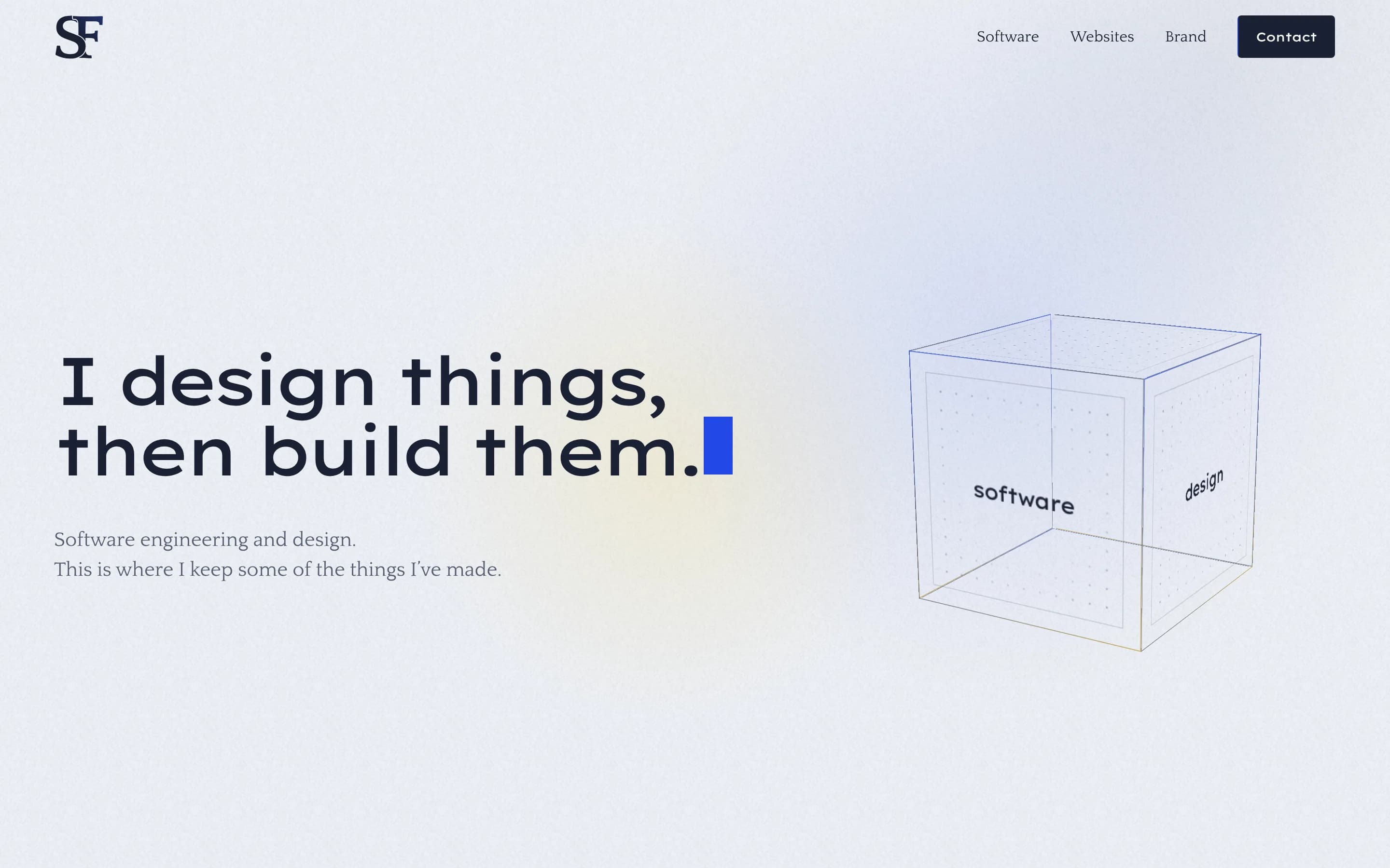
The mark holds its shape from a 16 pixel favicon up to the hero of this site.
 SF · Software engineering and designNew tab